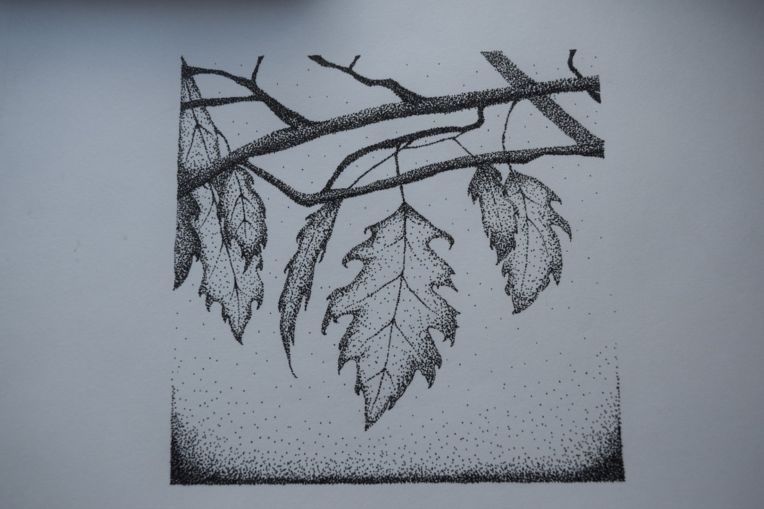
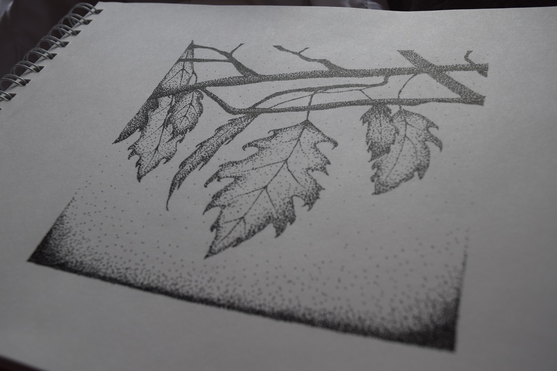
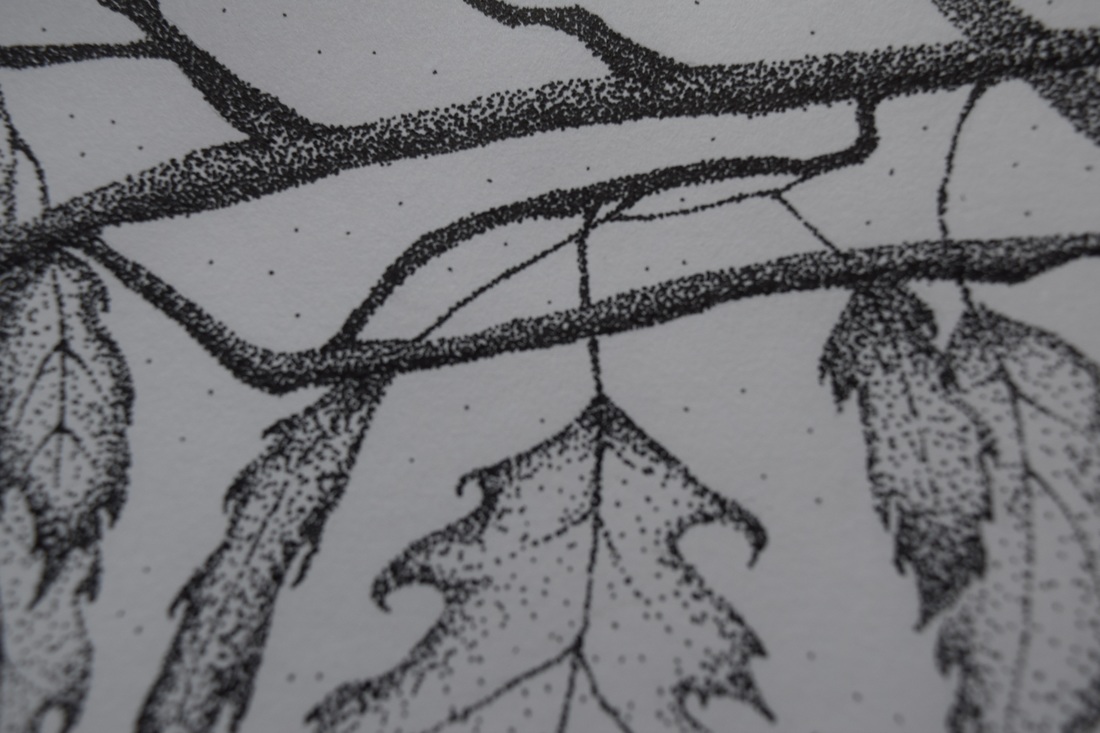
I am a big fan of using the stippling technique in my artwork. This is when you use tiny dots to make up an entire image. Also, I thought that stippling would have been a perfect way to reflect the skills that I have learned throughout the first unit in a different way. This unit was mainly about observing and developing skills to create art. With this piece, I chose to observe nature. Although less unique then observing something like real life people, I think nature in artwork to be beautiful because you can put your own twist on it. In the first unit, I also learned how to sketch, look for shadows and highlights, and create value. I used sketching in this piece because before dotting, I looked at the leaves and sketched their outline lightly with a pencil. Additionally, stippling in a great way to show value and it is a bit different than blending with graphite. Instead, you make a higher concentration of dots where it is darker. In this piece, there were shadows on the underside of the branches and on the edges of leaves so that is where I added more dots. Also, when looking at the leaves I was sketching, I noticed there was a gradient in the background. So, I concentrated lots of dots towards the bottom and dispersed them as I got higher up. I think I could work on making the gradient more gradual when stippling but my favorite part of the piece was the value I achieved in the branches. It took me a long time to get it to look like this because I had to go over with more dots often. Lastly, I really enjoyed the dots I placed in the background because it gives the art a mystical look to it, something that I always imagine when looking at nature.
0 Comments
For the challenge project, I chose to work on my colored pencil skills and draw an apple. While completing this project, I learned how you need to you lots of layers when shading with colored pencils. In order to achieve the blended look, I has repeatedly shade with various different colors. Even though the apple is red, I used a large range of colors such as brown, orange, yellow, and even slightly purple shades. My favorite part of the piece was the blending between with the lighter into darker red. Some things I would change is making the reflection whiter and making the dark part of the apple a little less brown. This was my first drawing experience and I really enjoyed it! I look forward to making more pieces with colored pencil in the future. 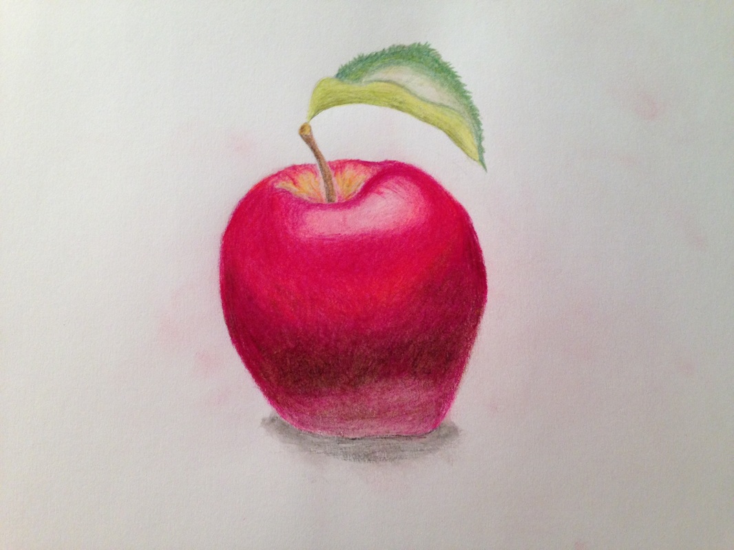 Also, earlier in the summer, I followed a tutorial to learn how to draw a realistic eye. This taught me how to layer with pencil and give an eye the 3-D look to it. 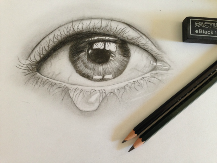
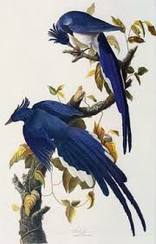
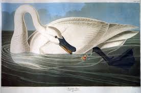
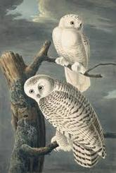
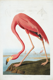
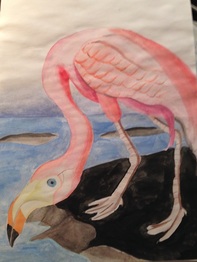
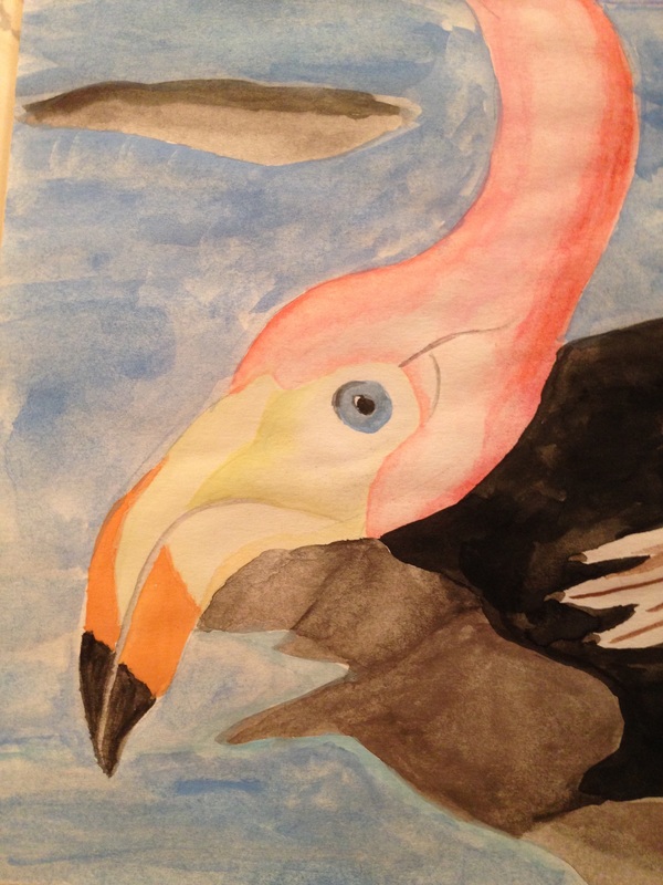
For the famous artist project, I observed John James Audubon's artwork. He was a businessman for over a decade and drew various birds as a hobby. Eventually, he entirely pursued art, and sought out to paint and describe every bird in America. His artwork is very detailed and he uses a lot of muted colors. The thing I enjoy the most about his work is the level of detail. It is as if he paints every feather he sees and this makes it look very realistic. I would like it if he used more bright colors. Even though the colors he does use add to the very real essence of the photos, I think different colors may allow the birds to pop. I personally would not hang his artwork in my house because I am more attracted to abstract photos. However, Audubon's paintings are perfect for his intentions: educated people about birds in a beautiful way. For my piece, I chose to replicate his flamingo painting because it was one of his brighter paintings. I used watercolor and made it even more of a brighter pink color. I struggled with making my piece as detailed as Audubon's. I think I could improve the feathers for example. My favorite part of the piece was the beak and the eye. I used a very small brush and was able to blend the water color.
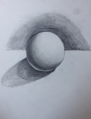
After finishing the shaded sphere, I was a lot more satisfied with the way it looked. I focused on shading without smudging and I think I still managed to make it look smooth. Also, I learned about the small reflection where the shadow meets the sphere, and I think it makes it look a lot more realistic. The only thing that I would change is the background. I think it looks a bit sloppy but it still provides contrast.
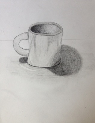
For the next assignment, observe and shade a small object, I chose to do a mug. I wasn't too thrilled with the outcome of this drawing and struggled with it. I was able to see where there was reflections and shadows but had a problem making it look realistic. It was also a very glossy surface and I didn't really show that with this drawing. The part of the drawing that I do like is the inside of the mug, I think the shading look nice in this area. So far this summer, I have looked into the way artists observe around them and began practicing drawing the things that I observe. The first assignment of the summer was to create a mind map of the things that I think artists observe. My list including things like colors and textures but after watching the videos included in the slide I discovered them may take into account of the emotions of real people as well. To try out drawing what I observe, I completed the timed sketching exercises. This exercise showing figures for a certain amount of time and I was only allotted a couple of minutes or seconds for each. Though difficult, it taught me to draw the shapes that I saw rather than the entire picture. Also, I found with more time I could spend time on the values I saw and make the drawing look like the real picture. Lastly, I began drawing the shaded sphere however I have not finished yet. This exercise teaches how to hold the pencil when shade and the different amount of pressure that you have to put on it to make a darker or lighter mark. I don't think the gradient in my sphere is smooth enough so I would like to perfect that and also add the shadow that the sphere is casting. Based off of the videos, I learned that artists often observe real life people in order to create their artwork. When I was brainstorming the different things that I thought artists observe, I was mainly thinking about the colors, shadows, and textures of objects rather than the emotions and actions of people. After realizing this, I realize that other humans may actually have the ability inspire art more than everyday things because there are so many different personalities out there. Also, it taught me the importance of being observant and curious. In this day in age, we usually keep our heads down or are constantly on our cell phones when walking through the city. However, it is so much more valuable to look around and see what everyone else is doing. It creates excitement in life and has the power to provoke creativity.
|
AuthorWrite something about yourself. No need to be fancy, just an overview. Archives
November 2016
Categories |
 RSS Feed
