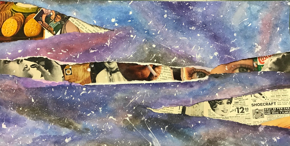
 For my recreation, I was inspired by the rips in the snow so I decided to do some rips through a galaxy. Underneath I made a collage of old-fashioned magazine clippings to show that, in the black holes of space, lies the past. My favorite part of this project is the way that the colors blended in the galaxy but if I did it again, I would make the stars look more realistic.
0 Comments
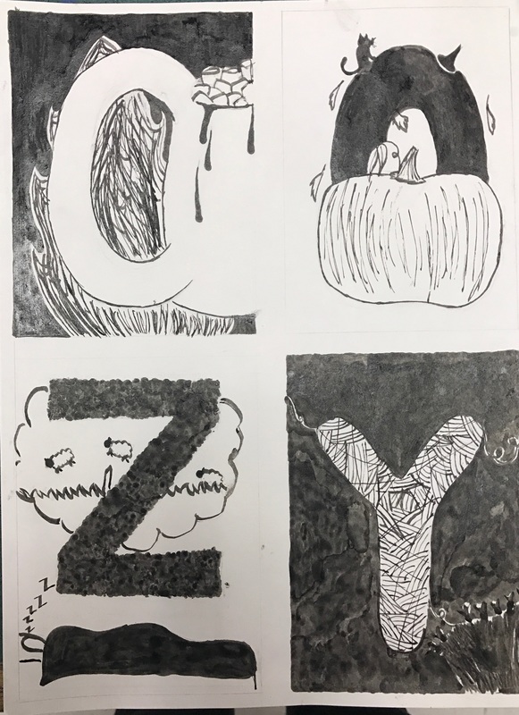 For my graphic letters, I chose to do the word "cozy." Then, for each letter, I did drawings of things that are cozy in my mind. The 'C' is for hot cocoa, the 'O' is for October, the 'Z' is for "Zzzz" and 'Y' is for yarn. This project was a good opportunity for me to practice my pen and ink skills and I enjoyed making different textures and patterns with it. If I were to do this again, I would try to make some of the drawing less messy such as the fire and the yarn.
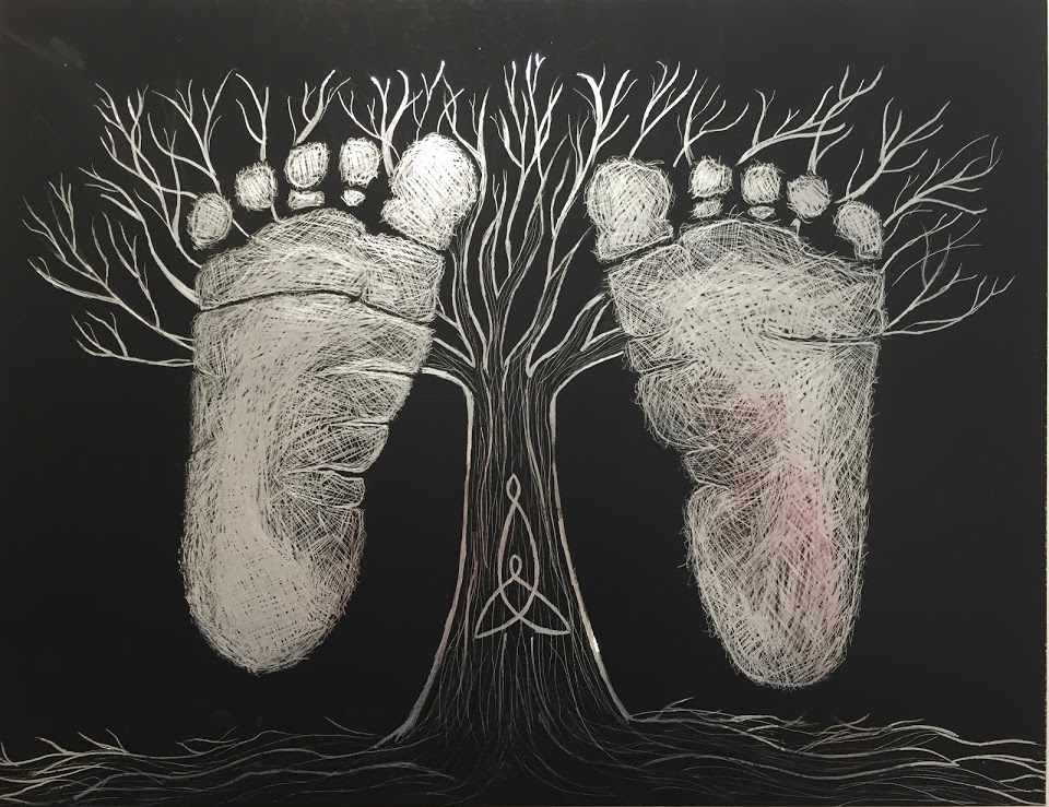 Every since I was little, I always knew that I wanted to be a mother and have a family in my future. So, for my future self project, I drew two baby footprints and a tree on scratchboard. Also, on the truck of the tree I drew the celtic symbol for motherhood. My favorite part of this project was the crosshatching that I did to show value on the feet. If I were to add something to this project, I would drew more branched and roots and add more details to the tree in general.
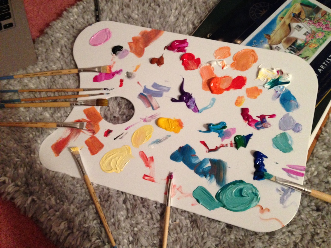
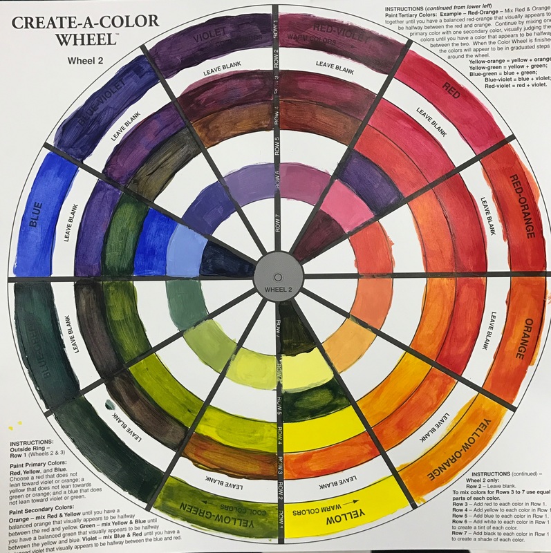 This activity was extremely helpful to learn the way paints act when mixing them together. In each column I added red, yellow, blue, white, and black to all of the colors in the first column. I think I could improve some of the shades by changing the paint ratio.
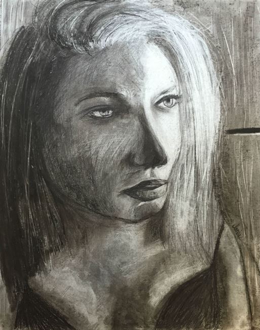 After being introduced to charcoal with the kinetic drawing, we took it to the next level and drew large self portraits. For this project, I practiced using the crosshatching technique to create shadows and I wasn't afraid to erase something if I didn't like the way it looked. My favorite part about my portrait is the shadows and highlights that I was able to achieve on the face and the realistic look of the hair. However, if I were to do this again, I would try to make it look a little bit more like myself, specifically the lips and the eyes.
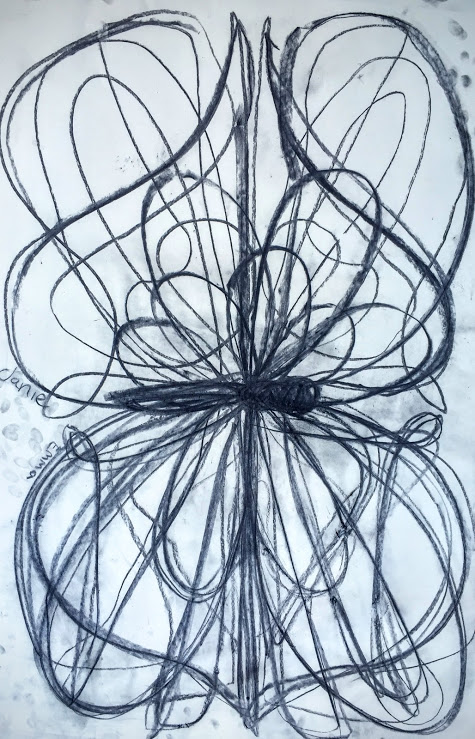 I worked together with Emma to make this piece and we created a butterfly with very interesting wings. This project was very fun because we could be careless with our marks and still create something that looks pretty cool. Although, I found it very difficult to mimic my partner's marks and if I were to do it again I would try to make it more symmetrical.
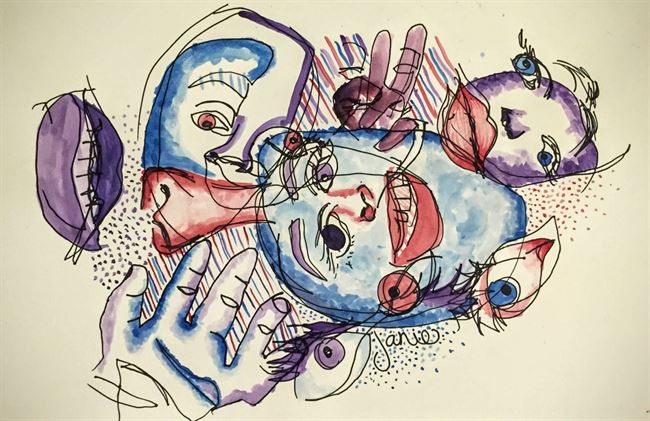 In this activity, I drew my face, hands, and eyes without looking at the paper. Then, I added color and texture to the drawings. I like the way that this project came out because it looks very abstract and it was also very helpful because I was able to accept imperfection
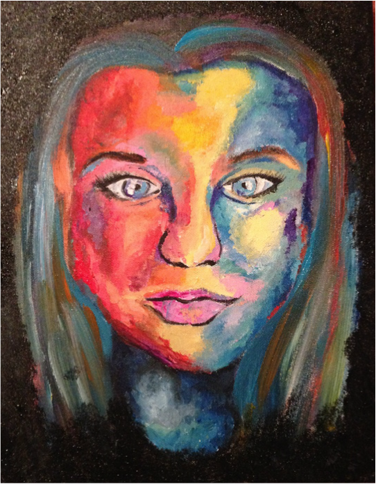
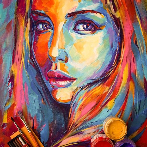
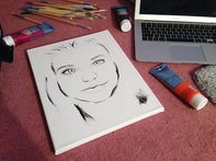
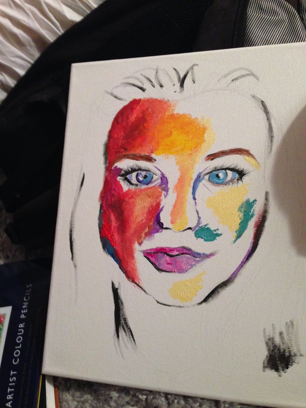
Though my self portrait does not look like me in the least, I am pleased with the final outcome. I chose to use acrylic paint to paint a picture of myself and rather than doing realistic colors, I used a variety of unnatural ones. I thought of this idea when looking through the work of more abstract artists and some self portraits on Pinterest (example below). Also, I tried painting a close up photo of me.
I wanted to do a more colorful self portrait because it is more exciting than average colors. Also, it looks like something from a comic book or as if a photo has a really cool filter. Also, I have never showed value with color before and I wanted to try that. My favorite part of the piece is the technique I used for the painting. On the face, I blotted the paint on to give it an interesting texture. Also, I like the way I blended the colors together. If I could change something about this piece, I would firstly make it look more like myself and additionally, I would add more detail to parts of my face like my eyes. It is very difficult to make a painting look like oneself but I did have a lot of fun trying.
 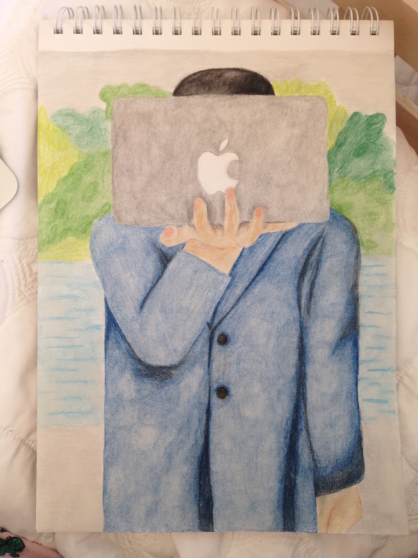 For the art parody project, I drew a modern version of the Magritte Apple. I thought this would be a good piece of art to parody and after thinking about other famous apples, I came up with the apple logo. I did this piece using colored pencils and I am most proud of the blending that I achieved. However, I struggled with the skin tone of the hands and tried to make the background textured but it did not come out so well. I also wish that it could have been more realistic.
In Kirby Ferguson's ted talk, "Embrace the Remix," he gives various examples, such as singer Bob Dylan and creator Steve Jobs, and explains how they have stolen ideas from singers and inventors in the past. Though copying someone else's work is often frowned upon, Ferguson's tells us that it is something we should embrace. As long as you are making something your own, it is okay to use ideas from others as inspiration. I think he makes a very good point because often times we get preoccupied with inventing or creating something of our own. There is a constant battle of being the first or a constant fear of accidental plagiarism. However, if we just create the things that we want to create, maybe with the help of some ideas we have seen before, we are more likely to make something beautiful in our artwork, rather than wasting time and stressing about being a copycat.
|
AuthorWrite something about yourself. No need to be fancy, just an overview. Archives
November 2016
Categories |
 RSS Feed
